Customizations
By default, the Actito SDK automatically handles most of the complexity around remote notifications on Android.
However, you may want finer control over how these mechanisms integrate with your app’s architecture and notification strategy.
The customizations offered in our library are part of the native SDKs. For more information on what customizations are available, please take a look at the native customization guides.
Android Customizations
By default, the Actito SDK automatically handles most of the complexity around remote notifications on Android.
However, you may want finer control over how these mechanisms integrate with your app’s architecture and notification strategy. This page describes the advanced configuration options available for push notifications, including how to override default SDK behaviors and customize their appearance.
Notification channels
Starting in Android 8 (Oreo), in order for your app to display notifications, you need to create channels. Without a channel, notifications will never appear in the notification manager. By default, the SDK creates a single channel named “Push Notifications”.
You can change the name and description of this default channel by adding the following entries to your app/res/strings.xml file:
<string name="actito_default_channel_name">Push Notifications</string>
<string name="actito_default_channel_description">This channel shows push notifications</string>
If you want to use your own notification channel as the default, first create it in your app, then specify its ID in your AndroidManifest.xml:
<meta-data
    android:name="com.actito.push.default_channel_id"
    android:value="my_custom_channel_id" />
To prevent Actito from automatically creating the default channel altogether, you can disable this behavior by adding the following metadata tag in your AndroidManifest.xml:
<meta-data
    android:name="com.actito.push.automatic_default_channel_enabled"
    android:value="false" />
Disabling Notification's Auto Cancel
By default, when a user taps a notification, the SDK automatically removes it from the Notification Center. If you prefer to manage this behavior yourself, you can disable auto-cancel by adding the following metadata tag in your AndroidManifest.xml:
<meta-data
    android:name="com.actito.push.notification_auto_cancel"
    android:value="false" />
Notification Icon Settings
By default, the SDK uses your application icon as the small icon for notifications. You can customize this by specifying a custom drawable resource and accent color in your AndroidManifest.xml:
<meta-data
    android:name="com.actito.push.notification_small_icon"
    android:resource="@drawable/ic_rocket_black_24dp" />

<meta-data
    android:name="com.actito.push.notification_accent_color"
    android:resource="@color/actito_blue" />
Notification LED Settings
Some devices display a notification light (LED) when a notification arrives. You can control the color and blink pattern either per-notification (via the Actito REST API or Dashboard) or by defining default values in your AndroidManifest.xml.
<meta-data
    android:name="com.actito.push.notification_lights_color"
    android:value="red" />

<meta-data
    android:name="com.actito.push.notification_lights_on"
    android:value="1000" />

<meta-data
    android:name="com.actito.push.notification_lights_off"
    android:value="2000" />
If neither are set, the SDK defaults to white, blinking 500 ms on / 1500 ms off.
Notifications UI
You can customize the visual appearance of Actito notifications by applying your own theme. This allows you to ensure consistent branding and appearance when presenting push notifications.
Themes are declared in a style resource file within your app’s res/values folder. You can then assign your custom theme to Actito’s NotificationActivity in your AndroidManifest.xml:
<activity
    android:name="com.actito.push.ui.NotificationActivity"
    android:theme="@style/Theme.App.Custom.Translucent" />
You can learn more about theming in the official Android developer guide.
When theming the NotificationActivity, we recommend using a transparent background so that Alert notifications appear seamlessly over your app’s content:
<style name="Theme.App.Custom.Translucent">
    <item name="android:windowIsTranslucent">true</item>
    <item name="android:windowBackground">@android:color/transparent</item>
</style>
Show progress indicator
You can control whether the notification activity displays a loading indicator while fetching or rendering notification content by setting the following metadata tag in your ApplicationManifest.xml:
<meta-data
    android:name="com.actito.push.ui.show_notification_progress"
    android:value="true" />
Notification Toasts
When executing actions from a notification, you can decide to display toasts messages by setting the following metadata tag in your ApplicationManifest.xml:
<meta-data
    android:name="com.actito.push.ui.show_notification_toasts"
    android:value="true" />
This can be particularly useful during development or debugging, when you want to confirm that notification actions are being triggered.
Custom Query Parameters
When presenting Webpage or HTML markup notifications, you can include links with query parameters to trigger in-app actions.
Custom close query parameter
By default, the SDK looks for the notificareCloseWindow query parameter to dismiss the notification. If you’d like to use a different parameter name, you can customize it by adding the following metadata tag to your ApplicationManifext.xml:
<meta-data
    android:name="com.actito.push.ui.close_window_query_parameter"
    android:value="customCloseParam" />
Open action query parameter
By default, the SDK looks for the notificareOpenAction query parameter to open a specific action. If you’d like to use a different parameter name, you can customize it by adding the following metadata tag to your ApplicationManifext.xml:
<meta-data
    android:name="com.actito.push.ui.open_action_query_parameter"
    android:value="customOpenActionParam" />
Open actions query parameter
By default, the SDK looks for the notificareOpenActions query parameter to open the actions menu. If you’d like to use a different parameter name, you can customize it by adding the following metadata tag to your ApplicationManifext.xml:
<meta-data
    android:name="com.actito.push.ui.open_actions_query_parameter"
    android:value="customOpenActionsParam" />
In-app Browser Personalization
When presenting In-app browser notification, you can personalize different aspects of the created browser.
Show custom tabs title
You can control whether the in-app browser displays the page title in the toolbar by setting the following metadata tag in your ApplicationManifest.xml:
<meta-data
    android:name="com.actito.push.ui.custom_tabs_show_title"
    android:value="true" />
Custom Tabs Color Scheme
You can control the color scheme (light or dark mode) of the in-app browser by setting the following metadata tag in your AndroidManifest.xml:
<meta-data
    android:name="com.actito.push.ui.custom_tabs_color_scheme"
    android:value="light" />
Supported values:
- light — Forces the light mode color scheme.
- dark — Forces the dark mode color scheme.
- Any other or missing value defaults to the system color scheme.
Toolbar Color
You can customize the toolbar color of the in-app browser by setting the following metadata tag in your ApplicationManifest.xml:
<meta-data
    android:name="com.actito.push.ui.custom_tabs_toolbar_color"
    android:resource="@color/custom_toolbar_color" />
Navigation Bar Color
You can customize the navigation bar color of the in-app browser by setting the following metadata tag in your ApplicationManifest.xml:
<meta-data
    android:name="com.actito.push.ui.custom_tabs_navigation_bar_color"
    android:resource="@color/custom_navigation_bar_color" />
Navigation Bar Divider Color
You can customize the navigation bar divider color of the in-app browser by setting the following metadata tag in your ApplicationManifest.xml:
<meta-data
    android:name="com.actito.push.ui.custom_tabs_navigation_bar_divider_color"
    android:resource="@color/custom_navigation_bar_divider_color" />
Action Labels
Labels used for Action Buttons in both the Notification Manager and Notification Dialogs can be localized by adding them as strings resources, where the name is equal to the label. To protect collision of resource names, they can be prefixed with a string. The prefix must then be set by using the options in the AndroidManifest.xml.
<meta-data
    android:name="com.actito.action_label_prefix"
    android:value="custom_prefix" />
Localizable Texts
Our library ships with support for multiple languages that can be customized. To do so, you just have to place translation keys and values in res/values/strings.xml(default) and provide translated versions in res/values-<locale>/strings.xml (for example res/values-fr/strings.xml for French).
You can find all the available translation keys here.
iOS Customizations
All the configurations described on this page can be defined in your app’s ActitoOptions.plist file. See the Customizations guide for details on how this file works.
Preserving existing notification categories
If your app already defines custom notification categories, and you want to keep them when Actito registers its own, you can preserve those existing categories by setting the following key in your ActitoOptions.plist:
<key>PRESERVE_EXISTING_NOTIFICATION_CATEGORIES</key>
<true/>
By default, Actito replaces existing notification categories when reloading its own. Enabling this option ensures that your app’s previously registered categories and actions remain available.
Disable Image Sharing
When presenting an Image Gallery notification, Actito allows users to share the displayed images by default. If you want to prevent this behavior, you can disable it by adding the following key to your ActitoOptions.plist:
<key>IMAGE_SHARING_ENABLED</key>
<false/>
Custom close query parameter
When presenting Webpage or HTML markup notifications, you can include links with query parameters to trigger in-app actions.
By default, the SDK looks for the notificareCloseWindow query parameter to dismiss the notification. If you’d like to use a different parameter name, you can customize it by adding the following key to your ActitoOptions.plist:
<key>CLOSE_WINDOW_QUERY_PARAMETER</key>
<string>customCloseParam</string>
Safari dismiss button style
When presenting an In-App Browser notification, you can customize the Safari dismiss button that appears in the top right corner. To do so, set the following key in your ActitoOptions.plist:
<key>SAFARI_DISMISS_BUTTON_STYLE</key>
<integer>0</integer>
You can select between three types:
- Done: By setting the value 0
- Close: By setting the value 1
- Cancel: By setting the value 2
Notifications Theming
You can customize the visual appearance of your notifications using the THEMES key in your ActitoOptions.plist. This allows you to define Light and Dark themes, so your notification interfaces remain consistent with your app’s overall style.
Each theme accepts a set of color keys that affect different interface elements, such as backgrounds, buttons, toolbars, and text fields.
<key>THEMES</key>
<dict>
    <key>LIGHT</key>
    <dict>
        <key>BACKGROUND_COLOR</key>
        <string>#000000</string>
        <key>ACTION_BUTTON_TEXT_COLOR</key>
        <string>#000000</string>
        <key>TOOLBAR_BACKGROUND_COLOR</key>
        <string>#000000</string>
        <key>ACTIVITY_INDICATOR_COLOR</key>
        <string>#000000</string>
        <key>BUTTON_TEXT_COLOR</key>
        <string>#000000</string>
        <key>TEXT_FIELD_TEXT_COLOR</key>
        <string>#000000</string>
        <key>TEXT_FIELD_BACKGROUND_COLOR</key>
        <string>#000000</string>
        <key>SAFARI_BAR_TINT_COLOR</key>
        <string>#000000</string>
        <key>SAFARI_CONTROLS_TINT_COLOR</key>
        <string>#000000</string>
    </dict>
    <key>DARK</key>
    <dict>
        <key>BACKGROUND_COLOR</key>
        <string>#FFFFFF</string>
        <key>ACTION_BUTTON_TEXT_COLOR</key>
        <string>#FFFFFF</string>
        <key>TOOLBAR_BACKGROUND_COLOR</key>
        <string>#FFFFFF</string>
        <key>ACTIVITY_INDICATOR_COLOR</key>
        <string>#FFFFFF</string>
        <key>BUTTON_TEXT_COLOR</key>
        <string>#FFFFFF</string>
        <key>TEXT_FIELD_TEXT_COLOR</key>
        <string>#FFFFFF</string>
        <key>TEXT_FIELD_BACKGROUND_COLOR</key>
        <string>#FFFFFF</string>
        <key>SAFARI_BAR_TINT_COLOR</key>
        <string>#FFFFFF</string>
        <key>SAFARI_CONTROLS_TINT_COLOR</key>
        <string>#FFFFFF</string>
    </dict>
</dict>
Available keys
BACKGROUND_COLOR: The main background color for the notification view.ACTION_BUTTON_TEXT_COLOR: The text color of action buttons displayed in notifications.TOOLBAR_BACKGROUND_COLOR: The color of any toolbar used within notification views.ACTIVITY_INDICATOR_COLOR: The tint color of loading indicators.BUTTON_TEXT_COLOR: The general text color of buttons used in interactive notifications.TEXT_FIELD_TEXT_COLOR: The color of text inside text input fields.TEXT_FIELD_BACKGROUND_COLOR: The background color of text fields.SAFARI_BAR_TINT_COLOR: The background tint color of the Safari view controller used for in-app browser notifications.SAFARI_CONTROLS_TINT_COLOR: The tint color for controls (e.g., buttons) within the Safari view controller.
Using a Strings Dictionary for Rich Push templates
For Rich Push Templates, iOS allows you to define localized placeholder text for Hidden Previews (when users choose to hide notification content on the lock screen). To support this, you can include a Localizable.stringsdict file in your project, defining how those preview texts appear.
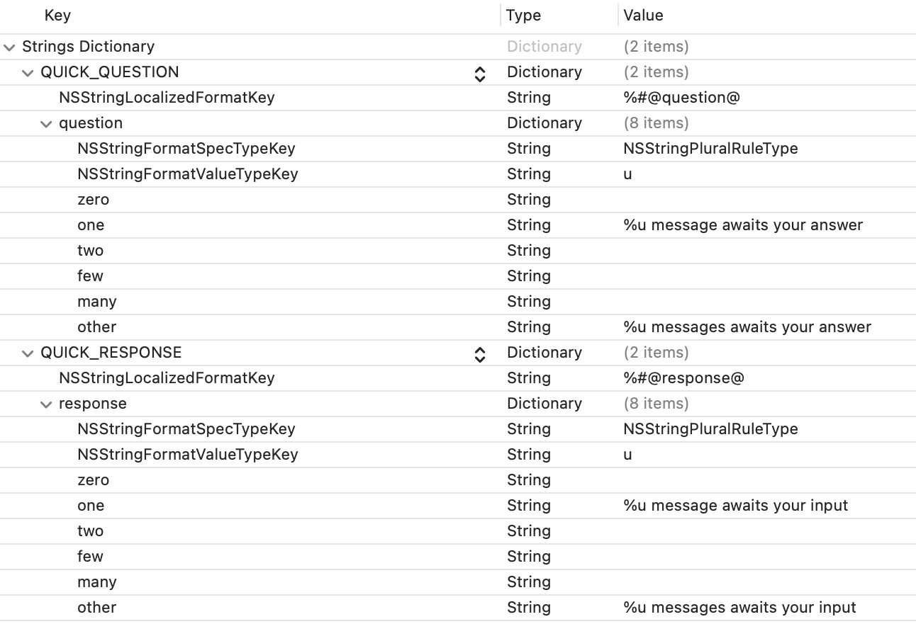
<?xml version="1.0" encoding="UTF-8"?>
<!DOCTYPE plist PUBLIC "-//Apple//DTD PLIST 1.0//EN" "http://www.apple.com/DTDs/PropertyList-1.0.dtd">
<plist version="1.0">
<dict>
    <key>MY_RICH_PUSH_TEMPLATE_TITLE</key>
    <dict>
        <key>NSStringLocalizedFormatKey</key>
        <string>%#@question@</string>
        <key>question</key>
        <dict>
            <key>NSStringFormatSpecTypeKey</key>
            <string>NSStringPluralRuleType</string>
            <key>NSStringFormatValueTypeKey</key>
            <string>u</string>
            <key>zero</key>
            <string></string>
            <key>one</key>
            <string>%u message awaits your answer</string>
            <key>two</key>
            <string></string>
            <key>few</key>
            <string></string>
            <key>many</key>
            <string></string>
            <key>other</key>
            <string>%u messages awaits your answer</string>
        </dict>
    </dict>
</dict>
</plist>
If your app supports several languages, repeat the operation for every localization file. This will allow you to customize how your notifications show in the lock screen when Hidden Previews are enabled.
Localizable texts
Our library ships with support for multiple languages that can be customized. To do so, you just have to include the translation keys in your Localizable.xcstrings or <locale>.lproj/Localizable.strings file and provide the desired texts.
You can find all the available translation keys here.